wk06_widgets
Ben Best
2016-02-19 18:17
precursors
RStudio new release
I recommend you download RStudio and install the latest release. It’s got a few lovely new features, including:
- Navigator for table of contents from headers in Rmarkdown
- R chunk controls in to run and set options
joining review
tidyr::complete: You Complete Me | i’m a chordata! urochordata!
interactive visualization
For the individual assignment, similar to last week, you’ll find it easiest to copy and paste from ## interactive visualization onwards in env-info/wk06_widgets.Rmd to your env-info_hw/wk06_widgets.Rmd inside your <user>.github.io repo. These files must be named exactly as expected, otherwise we won’t be able to find it and give you credit. You can then play with different chunks of the code. Be sure to answer all Tasks in your document - this is your individual assignment!
setup
Ensure that you’re in the same working directory env-info_hw when you Knit HTML as when you test code in the Console.
wd = 'env-info_hw'

# set working directory for Console (vs Rmd)
if (wd %in% list.files() & interactive()){
    setwd(wd)
}

# ensure working directory
if (basename(getwd()) != wd){
  stop(sprintf("WHOAH! Your working directory is not in '%s'!\n   getwd(): %s", wd, getwd()))
}

# set default eval option for R code chunks
#knitr::opts_chunk$set(eval=FALSE)
principles
Interactive visualization has been a mainstay of R since the beginning, but historically referred to as exploratory data analysis. The majority of innovation with interactive visualization has been happening with web technologies (HTML, CSS, JS, SVG). We’re not as futuristic yet as Minority Report (although I’m sure someone has hooked up Oculus Rift to R), we should have fun with trying out these visualizations.

Polished visualizations are helpful, but shouldn’t distract from the story of the data. Here are a few more principles to keep in mind:
Now let’s look at a few broad categories for chart types:
interacting at the console
There are a couple of useful packages for interacting within RStudio. Here are their package descriptions:
manipulate: Interactive plotting functions for use within RStudio. The manipulate function accepts a plotting expression and a set of controls (e.g. slider, picker, checkbox, or button) which are used to dynamically change values within the expression. When a value is changed using its corresponding control the expression is automatically re-executed and the plot is redrawn.ggvis: An implementation of an interactive grammar of graphics, taking the best parts of ‘ggplot2’, combining them with the reactive framework from ‘shiny’ and web graphics from ‘vega’.
So manipulate gives you controls (slider, picker, checkbox) within just the RStudio for any plotting package. The ggvis package provides its own plotting capabilities, borrowed in concept from ggplot2, for within the console (input_slider, input_select, input_checkbox), and also provides interactivity within the plot (add_tooltip on hover or click mouse events) and works with Shiny interactive applications. Neither package provides interactivity in HTML from rendered Rmarkdown documents.
manipulate
Let’s look at a simple ggplot histogram of eruptions from the Old Faithful geyser in Yellowstone.
suppressPackageStartupMessages({
  library(dplyr)
  library(ggplot2)
})

faithful %>%
  ggplot(aes(eruptions)) +
  geom_histogram(aes(y = ..density..),  bins = 20) +
  geom_density(color='blue', size=2, adjust = 1) +
  xlab('duration (minutes)') +
  ylab('frequency density') +
  ggtitle('geyser eruption duration')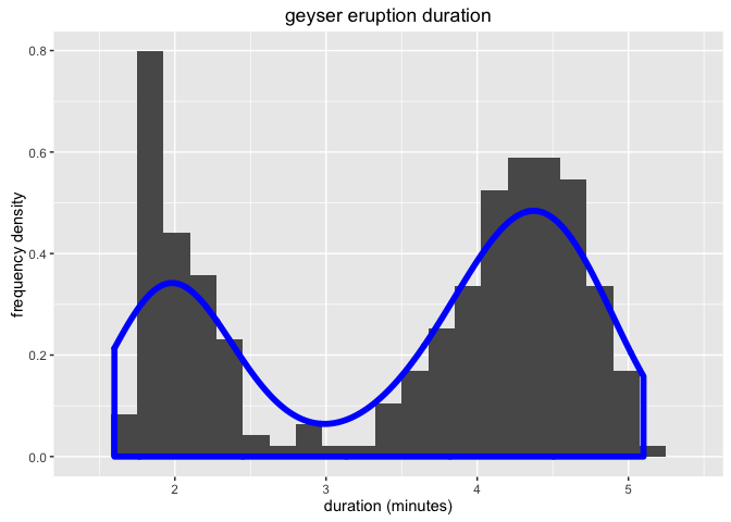
What is the effect of changing the adjust parameter on the line density?
We can use the manipulate function to provide interactive sliders, checkboxes and pickers. It only works within RStudio and does not work in a knitting context, so be sure to set eval=FALSE in the R chunk options.
library(manipulate) # install.packages('manipulate')

manipulate({

  faithful %>%
    ggplot(aes(eruptions)) +
    geom_histogram(aes(y = ..density..),  bins = 20) +
    geom_density(color='blue', size=2, adjust=a) +
    xlab('duration (minutes)') +
    ylab('frequency density') +
    ggtitle('geyser eruption duration')

}, a = slider(min = 0, max = 2, initial = 1, label = 'bandwidth adjustment', step = 0.2))
You should see the slider popout of a gear icon in th upper left of your Plots pane in RStudio.
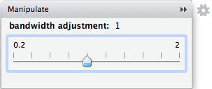
Task. Add another R chunk with a slider adjusting the number of bins from 5 to 50, with step increments of 5.
ggvis
You can do something similar with ggvis.
library(ggvis) # install.packages('ggvis')

faithful %>%
  ggvis(~eruptions) %>%
  layer_histograms(
    width = input_slider(0.1, 2, step = 0.2, label = 'bin width'),
    fill = 'blue') %>%
  add_axis('x', title = 'duration (minutes)') %>%
  add_axis('y', title = 'count')
The ggvis is slotted to become the feature-rich interactive version of the ggplot2 library. It cannot render to a static HTML document like manipulate, but can be used in a Shiny app.
Let’s use ggvis tooltip() to show values of a scatterplot on mouse hover.
cars = mtcars %>%
  add_rownames('model') %>%        # dplyr drops rownames
  mutate(id = row_number()) # add an id column to use ask the key

all_values <- function(x) {
  if(is.null(x)) return(NULL)
  row <- cars[cars$id == x$id, ]
  paste0(names(row), ": ", format(row), collapse = "<br/>")
}

cars %>%
  ggvis(x = ~wt, y = ~mpg, key := ~id) %>%
  layer_points() %>%
  add_tooltip(all_values, 'hover')
Task. Add another R chunk that only applies the add_tooltip on mouse click.
htmlwidgets
HTMLwidgets is a framework for connecting JavaScript libraries with R in 3 modes:
RStudio
standalone Rmd -> HTML
Shiny interactive application
Most browsers have a JavaScript Console (in Google Chrome: View, Developer; or r-click and Inspect).
The most advanced data visualizations are based on “data driven document” D3 JavaScript library by Mike Bostock (bl.ocks.org/mbostock). Here’s the d3 gallery, including my tiny contribution aster.
Here’s a list of htmlwidgets that have ported JavaScript libraries to R:
DT: tables
Before we dive into interactive visualizations, let’s first look at how we can use an htmlwidget to make a data table interactive.
dim(iris) # ?datasets::iris## [1] 150 5head(iris)## Sepal.Length Sepal.Width Petal.Length Petal.Width Species
## 1 5.1 3.5 1.4 0.2 setosa
## 2 4.9 3.0 1.4 0.2 setosa
## 3 4.7 3.2 1.3 0.2 setosa
## 4 4.6 3.1 1.5 0.2 setosa
## 5 5.0 3.6 1.4 0.2 setosa
## 6 5.4 3.9 1.7 0.4 setosaWe could first even do a prettier job of knitting a table with kable() from the knitr library.
library(dplyr)
library(knitr) # install.packages('kable')

head(iris) %>% kable()| Sepal.Length | Sepal.Width | Petal.Length | Petal.Width | Species |
|---|---|---|---|---|
| 5.1 | 3.5 | 1.4 | 0.2 | setosa |
| 4.9 | 3.0 | 1.4 | 0.2 | setosa |
| 4.7 | 3.2 | 1.3 | 0.2 | setosa |
| 4.6 | 3.1 | 1.5 | 0.2 | setosa |
| 5.0 | 3.6 | 1.4 | 0.2 | setosa |
| 5.4 | 3.9 | 1.7 | 0.4 | setosa |
Note the difference between using kable() on the console vs knitting to HTML.
datatable
But there are many more rows than just the first 6. Which is why an interactive widget could be so helpful.
library(DT) # install.packages('DT')

# default datatable
datatable(iris)
# remove document elements
datatable(iris, options = list(dom = 'tp'))Note how the dom option removed other elements from display such as the Show (length), Search (filtering) and Showing (information) elements from the default, but kept the table and pagination control.
Task. Output the table again with datatable and set the options to have pagelength of just 5 rows. (See ?datatable and http://rstudio.github.io/DT/).
metricsgraphics: line, bar, scatter
Now we’ll use the htmlwidget metricsgraphics to enable some hover capability in the HTML output.
library(metricsgraphics) # devtools::install_github("hrbrmstr/metricsgraphics")

mtcars %>%
  mjs_plot(x=wt, y=mpg, width=600, height=500) %>%
  mjs_point(color_accessor=carb, size_accessor=carb) %>%
mjs_labs(x="Weight of Car", y="Miles per Gallon")dygraphs: time series
library(dygraphs) # install.packages("dygraphs")

lungDeaths <- cbind(mdeaths, fdeaths)

dygraph(lungDeaths) %>%
dyRangeSelector()googleVis: …, geo, pie, tree, motion, …
The googleVis package ports most of the Google charts functionality.
For every R chunk must set option results='asis', and once before any googleVis plots, set op <- options(gvis.plot.tag='chart').
gvisLineChart
suppressPackageStartupMessages({
  library(googleVis)  # install.packages('googleVis')
})

# must set this option for googleVis charts to show up
op <- options(gvis.plot.tag='chart')

df=data.frame(
  country = c("US", "GB", "BR"),
  val1    = c(10, 13, 14),
  val2    = c(23, 12, 32))
Line <- gvisLineChart(df)
plot(Line)
line chart examples:
gvisTreeMap
Tree <- gvisTreeMap(Regions,
                    "Region", "Parent",
                    "Val", "Fac",
                    options=list(fontSize=16))
plot(Tree)- treemap example: The President’s 2016 Budget Proposal | Visual.ly
gvisMotionChart
Please note that the Motion Chart is only displayed when hosted on a web server, or if placed in a directory which has been added to the trusted sources in the [security settings of Macromedia] (http://www.macromedia.com/support/documentation/en/flashplayer/help/settings_manager04.html). See the googleVis package vignette for more details.
M <- gvisMotionChart(Fruits, 'Fruit', 'Year',
         options=list(width=400, height=350))
plot(M)- THE motion chart example: Gapminder World
gvisGeoChart
require(datasets)

states <- data.frame(state.name, state.x77)

GeoStates <- gvisGeoChart(
  states, "state.name", "Illiteracy",
  options=list(
    region="US",
    displayMode="regions",
    resolution="provinces",
    width=600, height=400))

plot(GeoStates)
spatial examples:
How America Came to Accept Gay Marriage | Visual.ly: chloropleth over time
Uber Is Taking Millions Of Manhattan Rides Away From Taxis | FiveThirtyEight: line, relationships, map
Overweight and Obesity Viz: map + line plot + sunburst
The United States of Energy | Visual.ly: map with cool compare charts
## Set options back to original options
options(op)leaflet: maps
addMarkers
library(leaflet)

leaflet() %>%
  addTiles() %>%  # add default OpenStreetMap map tiles
  addMarkers(lng=174.768, lat=-36.852, popup="The birthplace of R")
addRasterImage
suppressPackageStartupMessages({
  library(raster)       # install.packages('raster')
  library(leaflet)
  library(httr)         # install.packages('httr')
  library(RColorBrewer) # install.packages('RColorBrewer')
})

# get raster
url = 'https://github.com/ucsb-bren/env-info/raw/gh-pages/data/wind_energy_nrel_90m.tif'
tif = 'wind_energy_nrel_90m.tif'
if (!file.exists(tif)) writeBin(content(GET(url), 'raw'), tif)

# read raster
r = raster('wind_energy_nrel_90m.tif') # plot(r)

# generate color palette
pal = colorNumeric(rev(brewer.pal(11, 'Spectral')), values(r), na.color = "transparent")

# produce map
leaflet() %>%
  addProviderTiles("Stamen.TonerLite") %>%
  addRasterImage(r, colors = pal, opacity = 0.6) %>%
  addLegend(
    values = values(r), pal = pal,
title = "wind speed at 90m (NREL)")threejs: 3D
You can render 3D with threejs.
globejs
suppressPackageStartupMessages({
  library(threejs)
  library(maps)
})

# Plot populous world cities from the maps package.
data(world.cities, package="maps")
cities <- world.cities[order(world.cities$pop, decreasing=TRUE)[1:1000],]
value  <- 100 * cities$pop / max(cities$pop)

# Set up a data color map and plot
col <- rainbow(10, start=2.8 / 6, end=3.4 / 6)
col <- col[floor(length(col) * (100 - value) / 100) + 1]
globejs(lat=cities$lat, long=cities$long, value=value, color=col, atmosphere=TRUE)
scatterplot3js
library(threejs) # devtools::install_github('bwlewis/rthreejs')

# Pretty point cloud example, should run this with WebGL!
N     <- 20000
theta <- runif(N)*2*pi
phi   <- runif(N)*2*pi
R     <- 1.5
r     <- 1.0
x <- (R + r*cos(theta))*cos(phi)
y <- (R + r*cos(theta))*sin(phi)
z <- r*sin(theta)
d <- 6
h <- 6
t <- 2*runif(N) - 1
w <- t^2*sqrt(1-t^2)
x1 <- d*cos(theta)*sin(phi)*w
y1 <- d*sin(theta)*sin(phi)*w
i <- order(phi)
j <- order(t)
col <- c( rainbow(length(phi))[order(i)],
         rainbow(length(t),start=0, end=2/6)[order(j)])
M <- cbind(x=c(x,x1),y=c(y,y1),z=c(z,h*t))
scatterplot3js(M,size=0.25,color=col,bg="black")networkd3: networks
christophergandrud.github.io/networkD3/
simpleNetwork
suppressPackageStartupMessages({
  library(networkD3) # install.packages('networkD3')
})

# Create fake data
src <- c("A", "A", "A", "A",
        "B", "B", "C", "C", "D")
target <- c("B", "C", "D", "J",
            "E", "F", "G", "H", "I")
networkData <- data.frame(src, target)

# Plot
simpleNetwork(networkData)
forceNetwork
# Load data
data(MisLinks)
data(MisNodes)

# Plot
forceNetwork(Links = MisLinks, Nodes = MisNodes,
            Source = "source", Target = "target",
            Value = "value", NodeID = "name",
            Group = "group", opacity = 0.8)
sankeyNetwork
Sankey diagram - Wikipedia, the free encyclopedia
- flow (sankey): Category flow diagrams show movement between people, places, or things.
# Load energy projection data
URL <- paste0(
        "https://cdn.rawgit.com/christophergandrud/networkD3/",
        "master/JSONdata/energy.json")
Energy <- jsonlite::fromJSON(URL)
# Plot
sankeyNetwork(Links = Energy$links, Nodes = Energy$nodes, Source = "source",
             Target = "target", Value = "value", NodeID = "name",
units = "TWh", fontSize = 12, nodeWidth = 30)chorddiag: chord diagram
chord: Try a chord diagram when you want to represent movement or change between different groups of entities. It’s one of the more difficult types of data visualizations to use, but you can pack a whole lot into a single chart.
library(chorddiag) # devtools::install_github('mattflor/chorddiag')

# prep data
m <- matrix(c(11975,  5871, 8916, 2868,
              1951, 10048, 2060, 6171,
              8010, 16145, 8090, 8045,
              1013,   990,  940, 6907),
            byrow = TRUE,
            nrow = 4, ncol = 4)
haircolors <- c("black", "blonde", "brown", "red")
dimnames(m) <- list(
  have = haircolors,
  prefer = haircolors)
m
## prefer
## have black blonde brown red
## black 11975 5871 8916 2868
## blonde 1951 10048 2060 6171
## brown 8010 16145 8090 8045
## red 1013 990 940 6907groupColors <- c("#000000", "#FFDD89", "#957244", "#F26223")
# plot
chorddiag(m, groupColors = groupColors, groupnamePadding = 20)- chord diagram example: GED VIZ – Visualizing Global Economic Relations
streamgraph
library(dplyr)
library(babynames)   # install.packages('babynames')
library(streamgraph) # devtools::install_github("hrbrmstr/streamgraph")

babynames %>%
  filter(grepl("^Kr", name)) %>%
  group_by(year, name) %>%
  tally(wt=n) %>%
  streamgraph("name", "n", "year")
streamgraph examples:
wordcloud
library("d3wordcloud") # devtools::install_github("jbkunst/d3wordcloud")
words <- c("I", "love", "this", "package", "but", "I", "don't", "like", "use", "wordclouds")
freqs <- sample(seq(length(words)))
d3wordcloud(words, freqs)
resources
more examples
simulations:
infographics (static):
blogs
- 2015 – The Winners — Information is Beautiful Awards: interactive
- The 9 Best Data Visualization Examples from 2015 | Visually Blog
- visualcomplexity
- information aesthetics
- Flowing Data
- Data Basic: WordCounter, WTFcsv, SameDiff
- Interactive - Chart Porn
web services
charting apps:
infographic creators: